The Secret Behind Brands That Get Noticed, Remembered and Chosen
From snack packaging to building surfaces, discover how Caesarstone, Troo Good, IndoBevs and Wozoyo use design to shape customer experience and brand identity.
.png) by
by
Published: Oct 14, 2026 10:09 AM | 8 min read
 Follow Us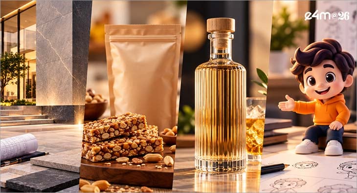

- Designers play a crucial role in enhancing customer experiences across various sectors, including architecture, food, beverages, and brand identity, by making thoughtful decisions about materials, shapes, and visual identity.
- Companies like Caesarstone and Troo Good illustrate how innovative design can improve product functionality and consumer trust, with Caesarstone introducing lightweight facade surfaces and Troo Good redesigning packaging for better product visibility and shelf stability.
- IndoBevs' Bonga Bonga liqueur emphasizes the importance of design in creating memorable social experiences, featuring a unique bottle that enhances the serving ritual and encourages consumer engagement through its visual appeal.
- Wozoyo's mascot, The Wise One, exemplifies how a brand's personality can foster customer connection, providing a relatable identity that influences communication and strengthens relationships with consumers over time.
A customer picks up a packet and immediately knows which flavour to choose. An architect looks at a surface and sees a new possibility for a building. A bottle catches someone’s attention, then becomes part of the way it is served. A character makes a brand feel familiar before the customer has explored its products. It can make a customer experience easier to understand, more enjoyable to participate in and more meaningful to remember.
For designers, this is an expansive brief. The work begins with materials, shapes, colours, typography and visual identity, yet its possibilities extend into how people feel and what they can do. A thoughtful decision can give someone confidence in a purchase, freedom in a project or a reason to look more closely. The customer experiences the outcome, often without knowing how much consideration went into it. The visible change might be a thinner slab, a stronger product image, an unusual bottle or a mascot. Behind it is an observation about people and an opportunity to serve them better.
The perspectives shared by Caesarstone, Troo Good, IndoBevs and Wozoyo show how varied those opportunities can be. Across architecture, food, beverages and brand identity, their accounts connect creative choices with practical and emotional experiences. Each offers designers a different question to understand- What could this decision make possible for the person encountering it?
For Caesarstone, that person includes the architect considering how a material could bring an idea to life. A façade surface contributes to the appearance of a building, while its dimensions, weight and installation requirements influence how it can be used. The design experience begins when those characteristics help a professional imagine a workable application. In a contribution shared with the names of Abbas Mithiborwala, Vice President, and Sudhi Nair, Product & Design Development Head, Caesarstone states, “We challenged the conventional idea that façade surfaces need to be heavy to be high performing. Caesarstone’s move into 3000x1200 mm, 5 mm sintered porcelain slabs for cladding, backed by a dry-cladding system and design-led finishes, brings together lightweight construction, technical performance and architectural expression, changing how designers can think about the building envelope.” These elements work together to shape the choices available to the architect. A surface becomes more useful when its visual possibilities are supported by a clear route into the project.
This furthers sheds light on customer experience in professional categories. The experience includes the freedom to explore, the ability to evaluate options and the confidence to move an idea towards execution. A material innovation can contribute by giving designers more to work with and more ways to express their intentions.
On a retail shelf, the opportunity takes a different form. A small packet has to introduce itself quickly. The shopper needs to recognise what is inside, identify the variant and feel comfortable making a choice. Thoughtful packaging can make that brief encounter feel straightforward. Troo Good’s account describes a redesign shaped around this moment. Raju Bhupati, Founder & CEO of Troo Good, who also identified the role of smart design packaging, stated, “Our original packaging was minimal and premium, but for the ₹5–₹10 consumer, seeing the product builds trust. We therefore made product imagery and variant differentiation more prominent, drawing from practices in mature packaged-food markets such as Japan. We also added barrier layers to the packaging, supporting shelf stability of up to nine months while protecting crunch and product quality.”
The decision brings together the experience of choosing and the experience of consuming. More prominent imagery helps the shopper assess the product. Clearer differentiation helps identify the preferred variant. The barrier layers address the quality the customer expects after opening the pack. For designers, this is a reminder of how much a compact object can accomplish. Packaging carries information, establishes recognition and protects the product. When these functions support one another, the customer benefits from an experience that begins at the shelf and continues at the first bite.
Vibin K Venugopal, Creative Head, Troo Good added, " The redesign retained Troo Good’s existing brand colours and typography, while using research and market feedback to improve how the pack performs on shelf. Product imagery and variant differentiation were made more prominent, giving the pack stronger visual weight and helping improve retail shelf pick-up. The packaging also helps keep the chikki crunchier for longer." The retention of colours and typography makes this account particularly useful. It shows how a brand can build on what customers already recognise while improving the way a pack communicates. Familiarity provides continuity; the revised hierarchy gives the shopper a clearer view of the product and its variants. Existing strengths can become the foundation for a more relevant experience. By listening to market feedback and reconsidering what deserves prominence, designers can help a familiar product meet its customer more effectively.
For IndoBevs, the design opportunity extends into the social experience surrounding a product. A bottle can attract attention, influence the way a drink is served and become an object people photograph or keep. Its design can contribute to several encounters over time. Geetika Mahandru, Co-Founder & President of IndoBevs, who oversees innovation and design, further highlighted, “Bonga Bonga started with an epiphanic observation about today's consumers. They don't drink just to look 'sophisticated', or even 'cool'; they drink to experience shared energy, and for the stories they can tell the next day. So rather than design yet another liqueur, we designed a moment with Bonga Bonga - the mystery liqueur shot that turns an evening into a night to remember. Every decision follows from this 'Design Feeling'. It's why the Bonga Bonga experience is described as 'Rager Shots'. The drink itself is infused with more than 40 botanicals and is meant to be had neat at -10°C. The Y-shaped bottle with its built-in infuser is like no other, and turns the pour into a dramatised ritual. People keep it on their shelves long after the last shot. Bonga Bonga's bold pink and blue, and its cast of illustrated characters, are meant to be spotted across a bar, and to pique curiosity.”
Design Thinking informs the business case for the brand too. The bottle is photographed and tends to travel through feeds organically, not just through our owned media. Moreover, Bonga Bonga was built for global shelves from day one, with a dedicated export variant. In its debut year itself, Bonga Bonga won Silver at the World Liqueur Awards; Silver at The Spirits Business Global Asian Masters; and Bronze for Design & Packaging at the International Spirits Challenge. As we speak, Bonga Bonga is turning up the heat in the UK, after Canada, Australia, and the UAE, among other international markets. Next up is a retail presence in the US." Her account gives the bottle a series of intended roles. The colours invite discovery from a distance. The shape and infuser contribute to the act of serving. The illustrated characters add personality, while the bottle’s appearance creates opportunities for photographs and conversation.
The customer sees one bottle, while the design brief considers the many moments in which that bottle might play a part. The experience becomes a source of ideas, helping the form, colour and storytelling work towards the same intention. Interestingly, Wozoyo explores another dimension of that relationship: the feeling a brand’s personality can create. Its design choice is a mascot, conceived with a temperament and a story. This gives the visual identity a human point of connection. Mohit Anand, CEO, Co-founder of Wozoyo, further highlighted, that Wozoyo’s distinctive design choice is its mascot The Wise One, a fourth monkey inspired by the lesser-known origin behind the three wise monkeys, who chose a different path from his brothers - instead of seeing no evil, hearing no evil or speaking no evil, he chose to watch the world, learn from it and speak only when it truly mattered. Unlike the conventional tech mascot, The Wise One is deliberately calm, observant, slightly imperfect and occasionally funny, a character who lives above the noise and complexity of the modern world rather than instructing people how to live, giving Wozoyo a distinctive identity in a category often dominated by functional and feature led communication. More than a visual device, he is the living expression of Wozoyo Life, a seeker who travelled the world, including Japan where the philosophy takes its roots, and returned with the wisdom to know when simplicity matters, allowing Wozoyo to stand apart not just through what it makes, but through the perspective and personality behind the brand.
Calmness, observation and humour offer designers something to build upon across expressions, language and storytelling. The character provides a reference for how the brand might relate to people, giving its communication a recognisable tone. The customer experience opportunity grows when that personality carries through other encounters. Clear product information, an approachable website and thoughtful service can reinforce the feeling introduced by the identity. Each interaction offers another chance to make the brand’s character tangible. This is where visual design can become the beginning of a wider relationship. Recognition helps people identify the brand; consistent behaviour helps them understand what to expect from it. The two can strengthen each other over time.
Together, these contributions show that design can create value in several ways. It can expand a professional’s choices, help a shopper understand a product, give an object a memorable role or make a brand easier to relate to. The customer experience emerges through these specific outcomes.
Disclaimer: All data points and statistics are attributed to published research studies and verified market research. All quotes are either sourced directly or attributed to public statements.
Read more news about Marketing News, Advertising News, PR and Corporate Communication News, Digital News, People Movement News
For more updates, be socially connected with us onInstagram, LinkedIn, Twitter, Facebook, YouTube & Google News