Google releases brighter ‘G’ icon
This is the Search engine giant’s first major design change in a decade
 by
by
Published: Oct 1, 2025 11:36 AM | 1 min read
 Follow Us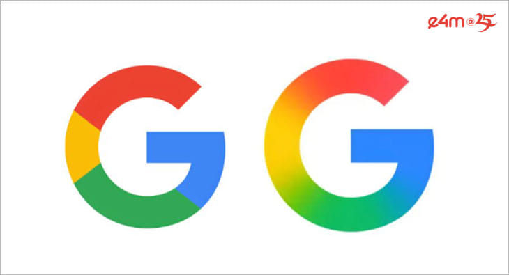

Google has introduced a refreshed version of its iconic four-color “G” logo, marking its first major design change in a decade.
Originally launched 10 years ago, the four-color G symbolized the company’s evolving identity across platforms, apps, and devices. Earlier this year, Google debuted a brighter, four-color gradient “G” for Search, and now the design is being adopted as the company-wide icon.
Read e4m report on Google launching AI mode in India
The updated logo, while retaining Google’s signature colors, features more vibrant hues and gradients meant to reflect the energy of the AI era. According to the company, the new design highlights its shift towards AI-powered innovation and creativity across products and technology.
The rollout began with Gemini in June and will gradually extend to other Google products, platforms, and services in the coming months, the company has said in its blog post.
Read more news about Digital Media, Internet Advertising, Marketing News, Television Media, Radio Media
For more updates, be socially connected with us onInstagram, LinkedIn, Twitter, Facebook, YouTube & Google News