Cloud Dancer: Why do advertisers love quiet colours?
From Mocha Mousse's warmth to Cloud Dancer's calm, the shift to near-neutrals is rewriting the rules of brand recall
 by
by
Published: Dec 13, 2025 9:20 AM | 9 min read
 Follow Us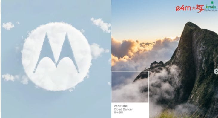

Remember when everyone lost their minds over ‘Mocha Mousse’? That warm, cosy brown had its moment in late last year, wrapping brands in earthy comfort like a well-made latte. Now, as we flip the calendar, Pantone's throwing us a curveball somehow. Meet ‘Cloud Dancer’, a soft, whisper-quiet white that's about as far from mocha as you can get without disappearing entirely.
If this year was about grounding and warmth, 2026 is going to be about floating and breathing. Essentially, taking a pause. The shift from Mocha Mousse to Cloud Dancer feels less like a colour evolution and more like a mood swing. From "let's get cosy" to "let's all just calm down for a second." And honestly? The advertising industry is here for it.
Read e4m report on Cloud Dancer
Walk into any brand strategy meeting these days, and you'll catch phrases like "visual breathing space," "cortisol-conscious design," and "quiet colours" being tossed around with the seriousness usually reserved for campaign budgets. In just a week, Cloud Dancer has become shorthand for something bigger than a pale shade of white. It's become a philosophy, a reaction, maybe even a collective exhale after years of our feeds being pummelled by neon gradients and maximalist chaos.
The numbers tell part of the story. According to a 2024 report by Adobe on digital consumption patterns, the average Indian consumer is exposed to over 4,000 brand messages daily across platforms, which is a whopping 67% increase from pre-pandemic levels. Social media feeds have become battlegrounds of neon gradients, maximalist graphics, and visual chaos that's left brands scrambling for a new approach. In this context, soft minimalism isn't a retreat. It's a strategy.
The tech-driven numbness and the rise of sameness
View this post on Instagram
The journey to this moment didn't start with wellness culture or meditation apps. It began with technology. Pranoy Kanojia, Vice President of Strategy at Enormous Brands, points to the tech sector's explosive growth over the past two decades as the primary catalyst for what he calls "the monochromisation of brands".
"This is a result of the growth of the tech sector in the last 20 years – where brands have optimised for web/app environments and small screens," Kanojia explains. "Less complexity of logos and designs means better rendering and readability, and load times. But in doing that, over time, brands have lost character and texture and fallen into a sea of sameness."
View this post on Instagram
This technical optimisation created an unintended consequence: a visual language stripped of personality in pursuit of functionality. As brands prioritised loading speeds and mobile readability, they inadvertently created a marketplace of look-alikes. The irony is sharp: in trying to stand out through clarity, brands ended up blending in. The current Cloud Dancer moment, then, represents both continuity and rebellion. It continues the minimalist trajectory while attempting to reclaim meaning within that constraint.
Another factor driving this shift? The immense visual chaos of social media itself. But Kanojia warns against reactive decisions in response to trends or cultural moments. "Going minimal monochrome should not be a reactive decision," he says. "Your brand's character and personality and embodiment should come from what it stands for and what role it wants to play in people's lives."
He cites Duroflex, the mattress and furniture brand, as a case study in intentional quiet colour strategy. While repositioning the brand around "Designed to Destress," Enormous Brands chose calm, soothing aesthetics for social media as "an antithesis to the chaos and visual stress of social media," creating "a visual and tonal relief on the feed." The choice wasn't dictated by Pantone or trend forecasts. It emerged from Duroflex’s simple brand purpose!
The distinction matters. When Cloud Dancer becomes a checklist item rather than a strategic choice, brands risk joining that "sea of sameness" Kanojia describes. The colour itself doesn't guarantee differentiation. The thinking behind it does. This is where many brands will stumble in 2026, mistaking the palette for the strategy, adopting soft minimalism without the substance to back it up.
"Pantone colour of the year should not dictate choices," Kanojia reminds us. "It is, after all, an editorial choice by Pantone to summarise the mood of the times. It is not a direction but a reflection. Craft and emotion are as vast a playground as the universe. And as colourful as the human brain. It should not be limited to grayscale and monochromes. Perhaps the Pantone colour of the year marks the time which brings the end to the tech-driven numbness and nudge brands and people to explore colour, emotion and life in its full texture again."
The cortisol conversation and visual relief
The shift toward Cloud Dancer and similar near-neutrals also reflects a broader cultural moment around overstimulation and stress. As screen time dominates daily routines and consumers navigate endless feeds of competing messages, there's a growing appetite for brands that offer visual relief rather than assault. Currently, it’s about being memorable for the right reasons. When everything around you is screaming, a whisper becomes the loudest sound in the room.
Sumanto Chattopadhyay, Former Executive Creative Director at Ogilvy South Asia, frames it as a physiological need. "We're leading over-stimulated, over-stressed, cortisol-fuelled lives," he says. "It's not helping that brands are bombarding us with a clutter of bold colours all screaming for attention. The need of the hour is something soft and soothing, something minimalist, something that masks out loud, retina-assaulting attention-whores and creates breathing space. Gentle, meditative shades are just what the doctor – and the brand consultant – ordered."
Craft, emotion, and the typographic turn
What makes quiet colours work when they do work isn't the absence of boldness but the presence of intention. Bhushan Kadam, Senior Vice President of Creative & Strategic Initiatives at White Rivers Media, argues that Cloud Dancer succeeds when brands use it as "a base, not as a quick path to minimalism."
"A quiet palette only fades when the thinking behind it is quiet too," Kadam says. "Cloud Dancer and other near-neutrals stand out when brands use them with intent. Strong typography, gentle textures and thoughtful materials help the palette feel alive. These details stop it from blending into every other minimalist design. The softness of the shade also lets the brand's message come through with more clarity."
This points to one of the most significant implications of the quiet colour movement: the elevation of craft. When colour retreats, everything else must work harder. Typography becomes the hero. Texture carries weight. White space transforms from emptiness to an active design element. Brands that succeed in this space are those that understand minimalism isn't about doing less but about making individual elements count more.
The psychological mechanics are fascinating. Research from the Colour Research & Application journal shows that near-neutral palettes reduce cognitive load by up to 40% compared to high-contrast, multi-hue designs. This creates what neuroscientists call “processing fluency,” the ease with which our brains handle information. When processing is easier, recall improves. When recall improves, brand equity grows. Cloud Dancer, in this sense, is less about aesthetics and more about cognitive ergonomics.
Kadam frames it as a matter of control rather than escape. "Quiet whites aren't an escape from noise. They're a way to take control of it," he explains. "These soft tones do respond to visual overload, but they are also a smart storytelling choice. When the noise drops, the craft becomes clearer. Viewers notice the emotion, the typography and the small design moves that often get lost in louder palettes."
This is the strategic advantage that forward-thinking agencies are banking on. In an environment where consumers are actively filtering out visual noise, brands that offer calm stand out by not trying to stand out in conventional ways. It's a judo move: using the force of marketplace chaos against itself.
The white space battle and client education
For creative professionals, the Cloud Dancer moment represents both opportunity and challenge. Chattopadhyay highlights a familiar agency struggle: "When creative people present designs with generous amounts of our beloved white space, clients typically ask us to put the 'blank areas to good use'. After all, every millimetre of ad real estate costs moolah, so let's fill it up with strident brand colours, brand symbols, brand messages."
This tension between creative restraint and commercial anxiety has defined countless client-agency relationships. The traditional logic is hard to argue against on a surface level. Why pay for space you're not using? But that logic belongs to an era of attention abundance. We're now in attention scarcity, where standing out means knowing when to shut up.
"Perhaps Cloud Dancer is a call to step back, to return to sanity," Chattopadhyay reflects. "Perhaps it is a way to highlight what is truly important, in our brands and in our lives."
The brands that will win the next cycle are those that understand this shift isn't about jumping on Pantone's bandwagon. It's about recognising a fundamental change in how consumers process information and make decisions in digitally saturated environments. Cloud Dancer is a symptom and solution; a reflection of our collective visual exhaustion and a tool for cutting through it.
What Cloud Dancer means for 2026 and beyond
As we walk into the next year, the implications of the quiet colour movement extend beyond colour theory into brand strategy, consumer psychology, and creative execution. The brands already experimenting with near-neutral palettes are now testing hypotheses about attention, memory, and meaning in oversaturated markets.
Kanojia's reminder feels particularly relevant here: "Pantone colour of the year should not dictate choices. It is, after all, an editorial choice by Pantone to summarise the mood of the times. It is not a direction but a reflection."
The question isn't whether your brand should adopt Cloud Dancer. It's whether the thinking behind soft minimalism aligns with your brand's core purpose and the role you want to play in consumers' lives. If the answer is strategic rather than reactive, if the palette serves the story rather than replacing it, then quiet colours can become a powerful tool for distinctiveness.
But if you're reaching for Cloud Dancer simply because it's 2025's "it" shade, you've already lost the plot. The colour is a canvas. What you paint on it, the craft, the emotion, the typography, the restraint, determines whether you'll be remembered or ignored.
Kadam puts it plainly: "When used with purpose, quiet colours don't just soothe. They sharpen the story and strengthen the brand's voice."
In an industry built on standing out, the most counterintuitive move might be the smartest: step back, breathe, and let the work speak through the silence. That's the real promise of Cloud Dancer; not as a colour, but as a philosophy of communication in an age that desperately needs less noise and more meaning.
Read more news about Marketing News, Advertising News, PR and Corporate Communication News, Digital News, People Movement News
For more updates, be socially connected with us onInstagram, LinkedIn, Twitter, Facebook, YouTube & Google News